Game 1: Platris
Playing tetris while platforming
Apr 21, 2023
Basics
- Genre: stressful puzzle platformer? You play tetris and a platformer at the same time.
- Links: play it on itch or check out the code on github
- Engine: Godot 3.5
- Time spent: March 30th - April 7th, but I already had a basic tetris implementation
Gameplay Video
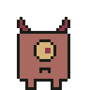
the enemy is named doug
Some Lessons I Learned
This is my first real game! Neat!! I got hooked as soon as I made the game hard enough that I lost while testing a few times in a row. Game dev is fun!
On the whole I’m pretty happy with how this game came out - I think it’s fun and it resembles my initial pich pretty well. But speaking of that pitch…
Figure out what the game is first
My original idea was “I’ll combine this tetris clone I made with a simple platformer where the landscape in the tetris game is the terrain that you’re jumping over in the platformer.” I couldn’t make that idea (or some related ones, like the currently-dropping tetris piece appearing in the platformer zone as well) work well.
The problem I had was reconciling two different physics models - platformer physics and tetris physics. In platformer physics movement is continuous and you’ve got gravity and collision and whatever, and in tetris physics movement is discrete - a piece is in one rotation and then it’s immediately in another. And so I kept clipping the player when pieces rotated or appeared and it sucked and learning Godot was confusing enough already 1 2.
Boy wouldn’t it be nice if you had videos to picture these mechanics and their problems! Unfortunately I didn’t think to start blogging about my gamedev journey until I finished this game. No videos this time :(
I did manage to include the “current piece appears in the platformer” idea via the computer mechanic eventually - but it sidesteps the physics problem since you can’t control the player while the current piece is moving within the platformer.
So I ditched that idea and didn’t quite know what the game was supposed to be. And in the moment I didn’t quite appreciate how much of a problem that was! Instead of sitting down and writing out how I thought the whole game work, I got into a cycle that looked like:
- feel stuck about what to do next
- think hard
- come up with an idea
- achieve coding flow state nirvana
- finish or ditch the idea
- goto 1
At least for me steps 2 and 4 have pretty high upfront costs! And so I was wasting all this time but, maybe because I don’t have much of an established process yet, I didn’t realize it till the game was about done.

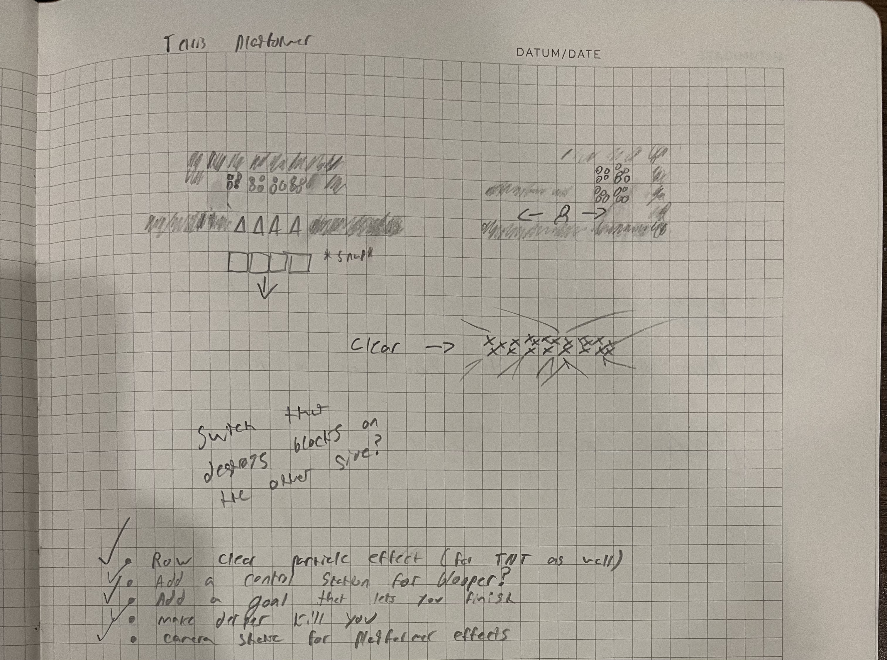
I think this is all the explicit planning I did?
That’s probably the biggest lesson I learned - it’s really hard to make something when you don’t know what you’re trying to make.
Basic artistic techniques are great


the final version of doug looks, uh, a little nicer than the initial one
My first prototypes used some free assets. These were great for getting started, but meant that the game looked like a mishmash of different art styles (because it was).
So I downloaded Aseprite and redrew everything. And the game looked even worse! It looked like total shit 3.
I distinctly remember a friend saying “yeah some of the art could be cleaned up but I really like the player” when the player was the one thing I hadn’t drawn myself yet.
What went wrong? I mean a lot. I’m not much of an artist! But I spent around 5 hours reading and watching videos and practicing and my art improved a bunch. There’s tons of great advice on the internet about how to improve at pixel art, but here’s some advice and resources that I found particularly helpful:
- Use a limited color pallet: this is probably the most common bit of advice out there. saint11’s take on consistency explains this well: the most common color inconsistency in games without color limitations is that some sprites don’t use colors that they could be using. I ended up using miri16’s 16 colors.
- Use simple shapes and put eyes on things: I got that advice (and so, so much more) from these slides from Giant Light Studio’s presentation at GDC 2022 were extremely helpful - and my platformer characters are pretty clear ripoffs of some of the art in the talk.
- Use outlines liberally: I learned about outlines (and a whole lot else) from this AdamCYounis aseprite crash course - although he’s got a whole playlist of material worth checking out.
- Make your pixels the same size: This phrasing came from Jon Topielski, who gave me a bunch of very helpful feedback (thanks Jon!). This advice roughly translates to “don’t scale different sprites by different amounts” - it’s a very concise explanation of why the flowers in the platformer look more detailed than the player or the walls.
While I’m definitely not aiming to be a great visual artist it was a lot of fun to improve a bit at pixel art, and it’s been helpful to be able to draw things that aren’t distractingly bad so that I can focus on programming.
Wrapping up
This post is too long. Or like, I think it’s too long and I’m not excited about editing it. I could keep going! If you’d like even more content in future game blogs let me know.
I had a ton of fun making platris. I’ll see you again soon for a post about “Sisyphus Needs a Nap,” a flight game about Sisyphus wacking a boulder up a hill so that he can take a nap while it rolls back down.